%201.avif)
.svg)
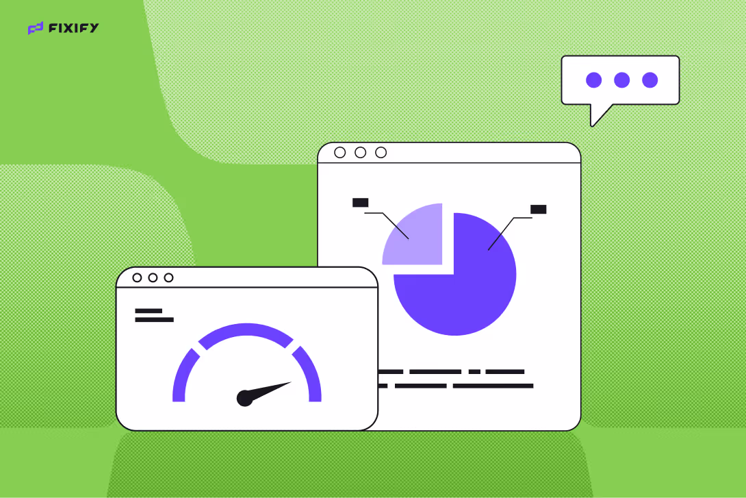
Measuring IT help desk performance: 7 metrics that actually matter

Listen to this blog as a podcast

.avif)
Imagine running a restaurant where your only feedback is how many napkins customers used.
Sure, it tells you someone sat at the table. But did the service feel helpful? Did the food arrive hot? Did anyone enjoy the experience? That’s what measuring IT help desk performance can feel like without the right metrics.
Many IT leaders have dashboards packed with numbers but no real insight into how their help desk is performing. And when ticket queues explode and users start venting in Slack, those gaps show fast.
Fixify is built to slice through that fog. We help IT teams track what matters so they can make smarter decisions faster and do it without burying themselves in spreadsheets.
Here are the seven metrics that actually matter — and how to use them to build a help desk that runs smoother, supports better, and scales smarter..
Not all metrics matter (but these ones do)
If your help desk metrics feel like noise, you’re not alone. Default dashboards often prioritize what's easy to measure, not what's useful. Ticket totals, CSAT scores, average response times — they look great in a quarterly report but don’t always tell you much about the user experience or your team’s sustainability.
The goal is to shift from vanity metrics (which often measure quantity over quality) to ones that you can act on.
These are the metrics that guide smarter decisions and actually move the needle for your team.
- Ticket volume (but only with context)
Raw ticket volume alone won’t tell you much. What matters is understanding why the tickets are coming in — and whether they could be prevented. When you break down volume by request type, time of day, or recurring issues, you can find patterns and identify work that might be automated or eliminated.
It also helps diagnose when and where your team is overwhelmed. Are onboarding requests flooding in every Monday? Are access tickets spiking at the end of the month? With this view, you can forecast more accurately and solve upstream problems.
For example, one of our customers noticed access tickets spiked every Friday. Turns out, new contractors were added to the system late in the week — with no automated provisioning. We helped them fix the process upstream, cutting those tickets by 60%.
- First response time (speed ≠ quality)
Fast isn’t always good. A rushed, unhelpful reply can tank user satisfaction just as much as a slow one. Use this first response time metric to spot inconsistent triage, gaps in coverage, or opportunities to use automation to deliver helpful first responses faster.
Pro tip: Set expectations by ticket category. Password resets don’t require the same service level agreement (SLA) as hardware provisioning. And if certain categories always get slow responses, consider whether those tickets need to be rerouted or better documented upfront.
- Time to resolution (aka how long people are stuck)
This is where real user frustration brews. Long resolution times often indicate messy handoffs, poor documentation or unclear workflows. With Fixify, you can spot slowdowns and identify which types of tickets need attention.
Pair resolution time with volume and ticket type to identify where your team is experiencing bottlenecks. IT teams with well tuned processes are already applying this mindset to streamline resolution workflows and reduce the mean time to resolution (MTTR).
Improving time to resolution also helps free up your analysts. Highly variable resolution times can create backlogs as help desk analysts get stuck on one big problem that drags for hours or days and causes other tickets to linger.
One IT team using Fixify realized their VPN-related tickets had the longest resolution time – because the knowledge base was outdated and buried three clicks deep. By automatically updating their playbook we were able to cut resolution time in half.
- Reopen rate (sneaky sign of a broken process)
A reopened ticket is a red flag.
It means something got missed — maybe the instructions weren’t clear, the fix didn’t stick, or the user gave up and created a duplicate ticket. Tracking this rate by analyst and ticket type can help pinpoint where issues are occurring.
Sometimes, a high reopen rate points to something simple, such as confusing instructions or overly-automated replies. For example, if 20% of your access tickets get reopened, it might mean users aren’t getting clear confirmation steps. Other times, it can reflect a deeper issue in how your team captures and shares knowledge. Either way, reopen rates are a goldmine for spotting gaps in your workflows and documentation.
- Sentiment and user satisfaction (without relying on CSAT)
Surveys are helpful — but they don’t tell the whole story.
CSAT scores often skew positive or negative because only the happiest (or most frustrated) users respond. That’s why Fixify goes deeper with sentiment analysis. Sentiment tells you what your every user actually feels. We analyze language, tone, and ticket interactions to spot issues before they turn into complaints.
Real sentiment data gives you a more representative, consistent feedback loop. Tech overload is a significant source of lost productivity, making understanding user sentiment all the more crucial.
One company we worked with discovered that tickets mentioning “still waiting” had a 30% lower CSAT— even when resolved quickly. That insight helped them improve updates and close-loop communication.
- Analyst workload (and burnout risk)
Measuring tickets per analyst helps, but it’s not only half the picture. A person handling 30 password resets isn’t carrying the same load as someone managing 10 custom provisioning requests.
Examine the time spent per ticket, the complexity of issues, and repeat tasks to identify who might be overwhelmed. Fixify makes it easy to model capacity and flag burnout risks before they hit.
You can also start to understand where your team’s strengths lie. For example, maybe one analyst is great at working high-touch onboarding tickets but consistently falls behind when they get assigned “miscellaneous” tickets that don’t have a defined playbook. This could indicate that additional training is required or perhaps tickets need to be rerouted to balance the workload and boost morale.
When you use workload data with care, it leads to a healthier, more effective team structure. Employees lose nearly 20 hours per week on low- or no-value tasks, and your help desk isn’t immune. Smart workload insights help reclaim that time.
- Escalation rates (and where they break down)
Escalations aren’t inherently bad — but too many (or too few) can both signal problems.
Use this metric to track which categories or workflows most often require escalation to higher levels.
Tracking escalation rates also helps with training and development. If a certain issue keeps getting escalated from Tier 1 to Tier 2, maybe Tier 1 just needs better documentation. Or maybe it’s time to adjust your ticket routing logic. We’ve seen teams reduce escalation rates for some categories by 40% just by adding better intake forms and context-gathering prompts.
You’re likely already thinking about how these insights apply to your team. If you’re curious how other IT leaders are approaching similar challenges, Fixify’s IT improvement ideas share real tactics that build on the metrics we’ve covered.
Metrics are only helpful if you act on them
Measuring these numbers once a month (or even once a day) won’t change much. What moves the needle is how you use them. Real improvements come from building regular habits around measurement and action.
Try this:
- Weekly check-ins: Pick 3 key metrics to review with your team every Monday morning.
- Monthly retros: Dig into one category where reopen or escalation rates are climbing. Make sure you include frontline analysts, not just managers.
- Quarterly tune-ups: Use insights to update automations and routing rules based on what’s working
What matters is consistency, transparency, and the willingness to tweak your playbook based on what you learn.
Fixify makes that easier by pulling insights into one place. No exporting to spreadsheets. No stale reports. Just a clear view of how your help desk is doing and where to go next.
Want more clarity and less chaos?
Fixify gives IT leaders a real-time view into the health of their help desk. We track what matters — from sentiment and SLA performance to backlog breakdowns — and we automate the stuff your team doesn’t need to touch.
Because we learn from your actual ticket data, our AI workflows and playbooks reflect how your team works, not some generic template. If you’re spending more time reading dashboards than fixing what’s behind them, it’s time for a better system.
See how Fixify helps you scale IT support.
Book a demo today and get a smarter, more human-centered help desk in your corner.
Related articles

What are managed AI services? A guide to AI-powered IT solutions


Best AI tools for business and IT teams

AI-Powered Triage: Bringing order to the ticket queue

Stay in the loop

Sign up to get notified about our latest news and blogs