%201.avif)
.svg)
2026 IT Help Desk Benchmark Report
.svg)
Executive summary
Help desk benchmarks are surprisingly hard to come by. There are plenty of generic IT surveys out there — the kind where respondents self-report their performance and round their numbers — but very few that start with actual ticket data and work up from there.
This means that IT leaders are often working in the dark. They're trying to optimize and scale their teams, take on new challenges (like supporting an explosion of new AI applications and top-down initiatives aimed at using those apps to increase efficiency), figure out where and how to add automation, and make sure their end users feel seen and supported so they can do their best work. And they're doing it all without the data they need. That's where Fixify's 2026 Help Desk Benchmark report comes in.
We analyzed more than 50,000 help desk tickets submitted across a range of organizations over fourteen months. Every number in what follows is derived from real ticket records: timestamps, categories, use cases, sentiment scores, response times, and resolution times. The goal was to answer the questions that every IT leader eventually asks: What does normal look like? How does our mix compare? How can we make our team more effective, and make the help desk experience even better for our end users?
.svg)
This report is based on help desk ticket data collected across more than 30 organizations over the fourteen months ending in February 2026. All data has been aggregated and anonymized; no individual organization is identified anywhere in the report. See the Appendix for full methodology details.

What we discovered in the data
As we dug into the data, six big themes about the current state of IT emerged. Here's what we saw — and what we think these insights mean for IT teams.
Demand is predictable — if you know where to look.
While managing incoming tickets can sometimes feel chaotic, we found that help desk volume follows consistent organizational rhythms. Eighty-two percent of tickets arrive during business hours, peaking at 11am. Tuesday is the busiest day of the week, carrying nearly a quarter of all volume. July is the busiest month of the year, running 29% above average, driven by summer hiring and mid-year access reviews. February through April are the quietest months. Knowing these patterns can give IT organizations the opportunity to plan for the surges and lulls.
The ticket mix is more concentrated than you might expect.
The use-case data helps us see even more of the picture. At the use-case level, the most frustrated tickets are those involving technical failures that stop work in progress — network troubleshooting (39%), hardware troubleshooting (38%), OS troubleshooting (37%), and application troubleshooting (31%) all exceed 30%. These are problems that interrupt the workday mid-stride.
More than 1 in 5 tickets is a work stoppage.
Here’s what we found.

22% of all help desk tickets represent an employee who cannot do their job until the issue is resolved.

Twenty-two percent of tickets are productivity-blocking — meaning the employee can’t do their job until the issue is resolved. That rate climbs with company size, reaching nearly one-third of all tickets for organizations with 1,000+ employees. Knowing which tickets stop work, and how to speed resolution for those tickets, can help IT teams make the most of their resources.
Most users aren't frustrated — but when they are, it's usually fixable.
81.6% of tickets that started with negative sentiment improved by resolution — moving to neutral or positive by close.
The sweet spot for a happy user resolution is 15 minutes to 4 hours. Tickets resolved in this window convert frustrated users at 93–97%. The 15-minute-to-1-hour band is particularly striking: tickets resolved in this time yield a 97% improvement rate, and more than a third of frustrated users become actively positive. Their feelings about the interaction aren’t just neutral. They feel genuinely appreciative.
Hardware and connectivity generate the most frustration — by far.
Our sentiment analysis also found that 1 in 4 hardware tickets arrives with negative sentiment — roughly 3x the average for all ticket types combined. Connectivity is a close second at 22%. Every other category falls well below these two. Yet more than 80% of negative users convert to satisfied users when their issue is resolved. This means that user frustration is often acute but fixable: fast-tracking these categories is the highest-leverage intervention for moving satisfaction numbers.
Company context shapes your benchmarks.
Fixify’s analysis shows that industry, size, and growth rate shape the ticket mix more than anything your IT team does. Fast- growth companies (>20% employee growth) face a 30% productivity-blocking rate and 13% negative sentiment — significantly more negative than stable companies. Enterprise organizations with 1,000+ employees show 3x the negative sentiment rate of small companies. Those differences are one big reason the IT benchmarks in this report can be so useful — they allow organizations to compare themselves to their peers rather than to the whole world of IT. We offer a breakdown by industry, size, and growth rate in Section 4.
The resolution time gap

Tickets with AI automation get resolved in a median of 4.4 hours. Without automation, when a human agent is performing the vast majority of the work, the median is 71 hours. (That's nearly three whole days!) So, while first response times are essentially identical whether or not you're using automation (about 5 minutes), we see a big gap in everything that happens after. Figuring out when automation makes the biggest difference in resolution time — which we know is critical for user happiness — can help IT teams decide how to add automation to their processes.
Five things IT teams can do today
With our findings in mind, here are the top five things IT teams can do now to help maximize resources and reduce chaos, meet end users where they need you most, and plan for what’s next.
1. Staff for Tuesday mornings and the summer surge.
Weight your coverage according to predictable patterns. For example, consider heavier staffing on Tuesdays, and use the February–April lull for infrastructure work and training.
2. Benchmark against your peer group, not the overall dataset.
A healthcare organization with 35% productivity-blocking tickets is running normally; a cybersecurity firm at the same rate would warrant investigation. Check Section 4 for benchmarks that let you see your IT metrics in your peer group context.
3. Build category-specific resolution SLAs.
A single SLA for all tickets doesn't match the reality of ticket diversity, so it can't give you the full picture of how your team is doing. For example, IAM and connectivity can be resolved in 3–4 hours with AI automation. Hardware and collaboration take 3–5 hours. Onboarding and offboarding workflows take 25–75+ hours structurally — not because they're mismanaged, but because they involve multi-step approvals and third-party coordination. SLAs for each category can give you a better picture of where you're succeeding, and where you may need to add more resources.
4. Target the 15-minute-to-4-hour window to turn frustrated users into satisfied ones.
This is the resolution speed sweet spot where most frustrated users become much happier. In fact, a third of them become actively positive. Hardware and connectivity tickets deserve priority here — they arrive with the most frustration and convert at 80%+ when resolved.
5. Add automation to improve resolution time, not response time.
IT teams can achieve a 5-minute first-response benchmark with or without AI automation. But they won’t achieve a 16x faster resolution time without automation. So, if you’re evaluating whether automation tools are worth the investment, the question to ask isn’t “Will this help us respond faster?” but, “Will this help us resolve our most common issues faster?” It’s also useful to evaluate the cost of slower resolution in terms of user satisfaction and lost productivity time.
How much demand for IT support should you expect, and when?
There's a planning question every IT leader faces at some point: How do I know if I'm staffed correctly? The answer usually involves some combination of gut feel, historical headaches, and the things you've gleaned from conversations with vendors and colleagues. This section gives you something more concrete — a data-backed picture of when IT demand typically arrives; its predictable patterns over the day, week, and year; and what it all means for scheduling coverage.
.avif)
What hours of the day do tickets come in?
If you had to guess the peak hour for help desk tickets, you'd probably say 9am. Users get to work, fire up their laptops, discover problems — that's when the tickets pour in, right?
Not quite.
The actual peak hour across the dataset is 11am. Volume builds steadily from 8am, climbs through the morning, and crests just before lunch — then gradually tapers through the afternoon and drops sharply after 5pm. The 9am hour is busy, but it's the 10am–1pm window that accounts for 31% of all daily volume — nearly one in three tickets arrives in those three hours.
What hours of the day do tickets come in?
In total, 76% of tickets arrive between 9am to 6pm Monday through Friday. The other 24% arrives after hours or on weekends. For companies that don't staff their help desk overnight, this means there's often a long queue of work waiting each morning. Those off-hours requests skew heavily toward provisioning and access requests rather than break-fix issues.
Here's the practical implication: while business-hours coverage handles the overwhelming majority of demand, help desk teams that staff symmetrically across the 9-5 window are misaligned with demand. Instead, consider front-loading coverage toward mid-morning when employees are hitting their first friction points of the day. This maximizes responsiveness when it matters most.
What days of the week are busiest?
97.5% of tickets arrive on weekdays. That's not a surprise — but the intraweek shape is worth understanding, because it's not what most people assume.
Tuesday is the busiest day of the week, accounting for 23.5% of all tickets. Monday is close behind at 21.1%. Together, Monday and Tuesday capture nearly 45% of weekly volume — almost half the week's demand compressed into two days. Volume declines steadily from there: Wednesday sits at 20.5%, Thursday drops to 17.8%, and Friday falls off a cliff at 14.6% — roughly 30% below the Monday-through-Thursday average.
What days of the week are busiest?
The Tuesday peak isn't just a statistical quirk. Monday brings its own surge — users returning from the weekend find new issues — but many of those issues don't become tickets until Tuesday morning, after the initial triage and attempts to self-resolve. The result is a front-loaded week where the first two days carry an outsized share of demand.
The data suggests weighting your staffing coverage toward Tuesday morning. Monday gets the reputation, but Tuesday gets the tickets.
What months of the year are busiest?
Monthly comparisons are tricky when your customer base is growing — more customers in December than January means raw counts go up regardless of seasonal effects. To isolate the seasonal signal, we normalized each organization's monthly ticket volume against its own average monthly rate, then aggregated across the dataset. An index of 100 represents a typical month; above 100 means busier than average.
What months of the year are busiest?
July is the busiest month of the year — running 29% above average. The mid-summer spike reflects several dynamics: summer onboarding cycles as new hires start before the fall, system reconfigurations as teams prepare for the back half of the year, and a general uptick in hardware issues as employees work from different locations. September and October are also elevated (12–13% above average), consistent with the broader back-to-work pattern following summer slowdowns.
The flip side: February and March are consistently the quietest period — February at 24% below average, March at 20% below. The post-holiday and post-January-rush slowdown is real, and it persists through early spring.
This normalization is based on organizations with at least six months of data. While the July peak and spring trough are consistent with workplace rhythms observed across the dataset, they should be treated as strong directional signals rather than immutable rules.


Does demand timing vary by company size?
One finding from this dataset that challenges conventional wisdom: business-hours concentration is remarkably consistent across company sizes.
Does demand timing vary by company size?
You might expect enterprise organizations to concentrate their tickets more tightly in business hours because of more structured IT processes, clearer support windows, and fewer after-hours requests. But the data doesn't support that. Every size category falls in the 77–80% range for business-hours tickets. Small companies, mid-size companies, and enterprises all generate about one-fifth to one-quarter of their tickets outside standard hours.
What does vary is peak hour: organizations under 100 employees and the 100–499 bucket peak at 10am, while the 500–999 bucket peaks at 11am. This one-hour shift is modest, but it may reflect that larger organizations have more layers of morning triage (stand-ups, team syncs) that delay the moment an issue becomes a ticket.
The practical takeaway: you don't need to over-engineer your after-hours coverage model based on company size assumptions. The demand signal is consistent — roughly 77–80% during business hours, 20–23% during off-hours — regardless of how many employees you have.
Tuesday is the busiest day of the week, and the Monday-Tuesday combination accounts for 45% of weekly volume. Front-loading analyst availability toward the first two days of the week is the simplest, most data-supported scheduling adjustment available. Friday, by contrast, runs 30% below the Monday-Thursday average — an opportunity to reallocate resources.
Late winter and early spring are the quietest stretch of the year for IT. That's a natural window for infrastructure work, system migrations, training initiatives, and anything else that benefits from lower baseline volume. If you've been waiting for a quiet moment, this is it.
If your organization follows the most common seasonal rhythms, July will be busy — 29% above average. September and October are also elevated. Avoid scheduling major rollouts, ensure full coverage through the summer-to-fall transition, and plan around it so you won't be surprised by the surge.
That’s the when. Next up: The what. Section 2 looks at the actual mix of requests — what employees are asking for help with, how that shifts by company size, and what the data tells us about where IT demand is really coming from.

What help do people really need?
Knowing when tickets arrive is half the planning puzzle. The other half is knowing what’s in the tickets. A help desk that’s mostly handling app access requests has a very different staffing and tooling profile than one dominated by hardware or identity issues — even at the same volume. This section breaks down the ticket mix across categories and use cases, shows how that mix shifts with company size, and identifies the patterns worth paying attention to.
What categories do tickets fall into?
Our dataset falls into nine ticket categories. One of them — Software & Applications — accounts for more than a third of all volume. Add Onboarding & Offboarding and IAM and you’ve covered more than 70%. The remaining six categories share the rest.
What categories do tickets fall into?
The frequency of Software & Applications tickets reflects how much of modern work runs through software, and how often that software needs tending, from new access to configuration changes, integrations, and troubleshooting. Onboarding & Offboarding is the story of growth-stage companies managing the employee lifecycle at scale: every new hire needs to be provisioned and every departure needs to be unwound. IAM shows the identity management burden of cloud-native environments: locked accounts, wrong permissions, MFA issues.
The long tail — Security, Connectivity, Other, Custom — makes up less than 10% combined. This isn’t trivial, but it’s not where the volume is.
What are the most common use cases?
Within these categories, the concentration is even more striking at the use-case level. App assignment — an employee requesting access to an application — accounts for more than 1 in 4 tickets. That overshadows everything else on the list.
What are the most common use cases?
The top three use cases — app assignment, permissions management, and employee offboarding — together account for 40% of all tickets. The remaining 40+ use cases share the rest. That kind of concentration is an opportunity for IT teams. If you can streamline or automate the top two or three use cases, it can make a big difference for the entire help desk.
One thing worth noting: employee lifecycle management — onboarding and offboarding of both employees and contractors — accounts for 16% of all tickets when you combine the four related use cases. For growth-stage companies actively hiring, this share is even larger.
More than 1 in 4 help desk tickets is an app assignment request — an employee needing access to a tool. This concentration reflects the growing complexity of SaaS environments, where every new hire needs access to dozens of applications, and where access changes with every role change, project shift, or vendor addition. For most organizations, the path to reducing app assignment volume isn't more IT staff — it's a well-documented library of your SaaS apps combined with up-to-date info on the approval process and approvers for each app.
.svg)
How does the ticket mix shift by company size?
The overall category breakdown of ticket types is a useful benchmark, but there is also significant variation by company size. The mix of what employees need help with changes substantially as organizations grow — and understanding that shift helps predict where your own help desk load is heading.
How does the ticket mix shift by company size?
A few patterns are worth highlighting:
.svg)
Software & Applications peaks sharply at 500–999 employees (57%). At this size, app assignment alone accounts for half of all tickets — reflecting the SaaS-intensive environments typical of mid-large tech companies. This is the most striking size-based pattern in the dataset.

Small companies (<100 employees) are Collaboration- and Security-heavy. Collaboration accounts for 22% of their tickets and Security for 15%. Small teams rely heavily on communication tools and often lack dedicated security resources, so both issue types flow directly to the help desk.
.svg)
Growth-stage companies (100–499) are in their onboarding peak. At 20% of their ticket mix, lifecycle management reflects the reality of active hiring: every new employee needs to be provisioned, and every departure unwound.
.svg)
Enterprise organizations (1,000+) show the most diversified mix with onboarding at 26% (reflecting high contractor and employee churn at scale), hardware at 13% (larger device fleets), and IAM at 17%. Software & Applications tickets dominate at mid-size organizations.
Does the ticket mix vary by day or season?
The category mix is broadly stable across weekdays, but a few weekly and seasonal patterns stand out.
Onboarding & offboarding spikes on Wednesdays and Saturdays. Wednesday runs 19.5% of total volume in this category — consistent with IT teams batch-processing provisioning and access changes mid-week. The Saturday spike (23%) likely reflects weekend processing of employee starts and departures timed around payroll cycles.
.svg)
Hardware tickets spike on weekends. Hardware's share jumps to 16% on Saturdays and 12% on Sundays, compared to 8–9% on weekdays. Weekend tickets skew toward device and OS troubleshooting — employees dealing with work-setup issues on their own time.
.svg)
Seasonal patterns are visible in the monthly data. Onboarding & Offboarding surges in summer and fall — peaking at 28% in July and 26% in November, driven by hiring cycles, intern programs, and year-end headcount changes. Hardware tickets rise in late summer and fall (9–11% in August through November), consistent with device refresh cycles. Software & Applications is elevated in spring (43–47% in March through May), likely reflecting app provisioning tied to Q1 budget approvals.
Onboarding & Offboarding tickets are significantly more common on Wednesdays than any other weekday. IT teams appear to naturally gravitate toward mid-week for provisioning and access changes — avoiding the Monday rush and the Friday wind-down. If your team already does this informally, consider making it a structured workflow: dedicated Wednesday morning blocks for provisioning work can reduce context-switching and improve throughput on what is often a high-volume, time-sensitive task.
How many tickets block employee productivity?
Not all tickets are created equal. Some are routine requests. An employee may need a new app or want a Slack channel created. Other tickets represent a genuine work stoppage — the employee can’t do their job until the issue is resolved.
We classified tickets into these two types based on use case. More than 1 in 5 tickets (22%) is productivity-blocking. For every 100 tickets your help desk receives, roughly 22 represent an employee sitting idle.
22% of all help desk tickets represent an employee who cannot do their job until the issue is resolved.
The top drivers of productivity-blocking tickets are permissions management (28% of all productivity-blocking tickets), login troubleshooting (22%), and application troubleshooting (16%). Together, they account for two-thirds of all work stoppages.
The productivity-blocking rate rises with company size — and the jump at enterprise scale is pronounced:
How many tickets block employee productivity?
For small companies, 12.5% of tickets are productivity-blocking. The mix is dominated by Collaboration and Onboarding requests, which are largely administrative. At 1,000+ employees, nearly one-third of all tickets represent a work stoppage, reflecting the greater complexity of identity management and technology environments at scale.
Companies with 500–999 employees have a lower productivity-blocking rate than the 100–499 category. This is a composition effect: the 500–999 range is dominated by organizations whose ticket mix is weighted toward app assignment — routine requests rather than troubleshooting. Adjusting for that effect, the rate follows a consistent upward curve.
Productivity-blocking tickets also arrive with significantly more frustration. Their negative sentiment rate is nearly 5x that of non-blocking tickets — 21% negative versus 4%. When employees can't work, they say so.
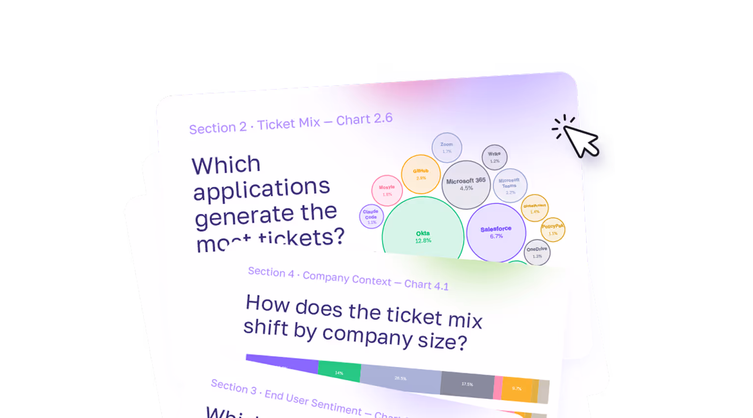
Which applications generate the most tickets?
For the subset of organizations with application-level data (8% of tickets), we can see which specific tools are generating support volume. Okta leads by a wide margin, appearing in nearly 13% of all app-tagged tickets — roughly 2x the volume of the next most common application.
Which applications generate the most tickets?
The list is a recognizable modern enterprise stack: identity management (Okta, 1Password), productivity suites (Microsoft 365, Google Workspace, Slack), project tools (JIRA, Confluence, Wrike), device management (Mosyle, Intune), and an emerging layer of AI applications.
Across the dataset, 483 distinct applications appear — nearly 500 different tools generating support requests. App diversity grows with company size: organizations under 100 employees average ~5 distinct apps in their ticket data, while those over 1,000 employees average ~63.
On the sentiment side, not all apps generate equal frustration. File sync, email, and security tools generate the most negative sentiment: OneDrive at 39%, Outlook at 37%, PolicyPak at 31%, and GlobalProtect at 26%. When a VPN won’t connect, a file won’t sync, or a security policy blocks work, users feel it immediately and submit tickets that show their frustration. At the other end, AI tools and password managers skew notably positive. These tend to be proactive requests for access rather than complaints.
AI tools, including Claude Code, Gemini Enterprise, and ChatGPT Enterprise, have arrived in help desk ticket data. The vast majority of AI-related tickets are access provisioning requests, not troubleshooting, which is consistent with early adoption phases. Expect this category to grow as AI tool deployments expand and employees begin encountering configuration, integration, and permission issues they haven’t faced before.
If roughly 1 in 4 tickets is an app assignment request, evaluate whether AI automation tools (like Fixify!) could absorb a meaningful share of that volume before it reaches the help desk. Even a 30% reduction in app assignment tickets would move your overall numbers.
Onboarding & Offboarding and IAM together account for a third of all tickets, and their combined share grows with company size. If you’re approaching the 500- or 1,000-employee threshold, now is the time to invest in identity infrastructure and automated lifecycle workflows.
The data suggests IT teams naturally batch provisioning work mid-week. Making that explicit — dedicating Wednesday time for onboarding and offboarding tasks — can reduce context-switching and improve throughput on work that’s both high-volume and time-sensitive.
That’s the what. Next: How are users feeling about it? Section 3 looks at the sentiment users bring to their tickets, how that changes by the time the ticket closes, and what IT teams can do to make a difference.
How do your employees feel about IT support — and what can you do to make them even happier?
Most help desk metrics measure the IT team: how fast they respond, how many tickets they close, and what the backlog looks like. But we wanted to look at user sentiment, too. How does the person on the other end experience IT? Standard IT metrics and user sentiment are related, but they’re not identical, and the gap between them offers a lot of opportunities for IT teams to up their game.
This section looks at what users bring to their tickets emotionally, how their feelings shift by the time the ticket closes, and what drives the difference.
How do users feel when they submit tickets?
The vast majority of tickets (82%) arrive with no emotional charge at all. Employees submit a request, describe their issue, and move on matter-of-factly, without visible frustration or enthusiasm. The remaining 18% are split roughly evenly between positive and negative.
How do users feel when they submit tickets?
For IT teams looking to level up, the 8.7% negative baseline is the number to benchmark against. Roughly 1 in 11 tickets arrives with a frustrated or unhappy user on the other end. That adds up. At a company processing 500 tickets a month, that’s roughly 44 frustrated employees who are telling you, through the tone of their submission, that something has gone wrong enough to generate emotion.
Does sentiment improve by resolution?
Here’s the most important finding in this section, and one of the most important findings for IT leaders overall. It shows how impactful IT work is when it comes to supporting the wellbeing and productivity of an entire organization.
81.6% of tickets that started with negative sentiment improved by resolution — moving to neutral or positive by close.
Of the tickets that begin with negative sentiment, 81.6% improve by the time the ticket is resolved — users move to either a neutral (63.1%) or positive (18.4%) sentiment. Only 18.4% of frustrated users are still negative at close.
Does sentiment improve by resolution?
Looking at the full picture across all tickets — not just negative starters — 23.5% improved, 63.2% stayed the same, and 13.2% worsened by resolution. The worsening figure deserves a closer look: it’s driven almost entirely by neutral tickets that slipped to negative by close (6.3% of the large neutral base), not by positive tickets collapsing. Only 4.5% of tickets that started positive ended negative.
One pattern worth flagging: positive sentiment is harder to maintain than negative sentiment is to fix. Only 31.6% of tickets that started positive held onto that sentiment through resolution — nearly two-thirds drifted to neutral. This suggests that even when users arrive enthusiastic, slow or complex resolutions can dampen that initial goodwill. The practical implication: even people who submit positive-start tickets need care to get to a good outcome.
Which ticket types generate the most frustration?
Not all ticket types arrive equally charged. The category and use case mix matters enormously — and the data shows a clear pattern: frustration correlates (almost perfectly) with disruption of the most basic tools users need to get their jobs done.
Hardware and connectivity are, by far, the highest-frustration categories. One in four hardware tickets arrives with negative sentiment — roughly 3x the overall average. Connectivity follows at 22%. When something physical breaks, or the network goes down, users feel it immediately and their frustration shows through.
Which ticket types generate the most frustration?
The use-case data helps us see even more of the picture. At the use-case level, the most frustrated tickets are those involving technical failures that stop work in progress — network troubleshooting (39%), hardware troubleshooting (38%), OS troubleshooting (37%), and application troubleshooting (31%) all exceed 30%. These are problems that interrupt the workday mid-stride.
Use cases by ticket volume and negative sentiment rate
The contrast at the extremes is striking. Network, OS, and hardware troubleshooting each approach or exceed 40% negative — but they’re relatively lower-volume categories. Login troubleshooting is the most consequential frustration driver in practice: it’s the fifth-most common use case in the dataset, and 21% of those tickets arrive negative. That combination of meaningful volume and elevated frustration puts it in a category of its own.
At the other end, app assignment, email management, employee onboarding, and group management are all below 3% negative. These are expected administrative workflows. Users know what they’re asking for, they’re not in crisis, and the submissions reflect it.
Does company size affect user sentiment?
Larger organizations generate more frustrated tickets. The relationship is consistent and directional — and the jump at enterprise scale is pronounced:
Does company size affect user sentiment?
The 1,000+ organizations' 17.2% negative rate is more than three times that of sub-100-employee companies. The primary driver is the ticket mix: larger organizations have more login troubleshooting, hardware issues, and application troubleshooting tickets — all categories that carry elevated frustration. At scale, the help desk increasingly absorbs the problems that genuinely block people from working, and those problems come with emotion attached.
Small companies (<100) are notable for a different reason: they show the highest positive sentiment rate at 16.6%. This reflects a ticket mix dominated by administrative requests. And it’s likely that smaller organizations promote a closer, more personal relationship between employees and their IT teams.
How does resolution speed affect satisfaction?
Speed and satisfaction aren’t the same thing — but the data shows that they’re closely related.
First response times are essentially identical across all three groups — all sit at a median of roughly 5 minutes. The speed difference doesn’t emerge at initial pickup; it emerges during the resolution process itself.
Tickets submitted with positive sentiment resolve more than twice as fast as tickets submitted with negative sentiment. The median resolution time for positive-start tickets is 8.8 hours. For neutral tickets, it’s 16.6 hours. For negative tickets, it’s 21.0 hours.
How does resolution speed affect satisfaction?

Frustrated users may be submitting harder problems that take longer. Or the extended back-and-forth of a slow resolution may cause frustration in users who started neutral. What the data makes clear is that speed and satisfaction move together — and that fast resolution is the most reliable path from frustration to satisfaction.
The improvement rate data makes this concrete — and it shows an area where IT teams can really improve their users’ experiences:
The speed-satisfaction sweet spot for help desk tickets
The sweet spot for a happy user resolution is 15 minutes to 4 hours. Tickets resolved in this window convert frustrated users at 93–97%. The 15-minute-to-1-hour band is particularly striking: tickets resolved in this time yield a 97% improvement rate, and more than a third of frustrated users become actively positive. Their feelings about the interaction aren’t just neutral. They feel genuinely appreciative.
Under 15 minutes performs somewhat less well (82%), likely because very fast closures sometimes reflect auto-closures or triage rather than genuine resolution, leaving some frustrated users still unresolved.
The data suggests that what frustrated users value most isn’t raw speed but attentive speed — a meaningful resolution delivered quickly.
After 3 days, the sentiment conversion rate drops to 68%. The frustrated user who waited a week is substantially less likely to walk away satisfied than the one who got a resolution in an hour — even if the eventual resolution is the same.
When adjusted to local time, sentiment is remarkably stable across the day — but the early morning stands out. Tickets submitted between 6am and 9am carry a modestly elevated negative rate (11%) compared to the afternoon (8%). The most likely explanation: employees arrive at work, discover something broke overnight, and submit frustrated tickets before their first cup of coffee. By afternoon, the mix has shifted toward routine requests.
Does sentiment improvement vary by category?
For tickets that started negative, the improvement rate once an issue is resolved is consistently high across all categories — a strong signal that resolution genuinely shifts user experience regardless of what went wrong.
Does help desk ticket sentiment improvement vary by category?
Every category shows an improvement rate of 80% or better for tickets that started negative. Hardware and Connectivity are particularly notable. Despite generating the most frustration at submission (25% and 22% negative respectively), they convert at 80–82%, meaning that even the most frustrated users are largely satisfied by resolution. The problem isn’t that these issues are frustrating to users long-term; it’s that they’re acutely disruptive in the moment.
These categories arrive with negative sentiment at 2–3x the overall rate — 25% and 22% respectively. A dedicated fast-track process for physical failures and connectivity issues, even something as simple as a committed response window, can meaningfully shift the experience for the users who are most likely to be frustrated.
This is the sweet spot where 93–97% of frustrated users improve — and more than a third become actively positive. If you can only prioritize one thing, it’s getting negative-start tickets resolved within 4 hours.
The 82% improvement rate from negative-to-resolved is a meaningful benchmark. Ifyour organization is seeing lower rates, it most likely reflects slow resolution times or issues that aren’t fully resolved on first contact. Both are fixable — but you have to measure how your users are feeling to know if you’re making progress.
Section 4 looks at the organizational factors, including remote work, company stage, and industry, that affect what ends up in the help desk queue.
How does your organization's profile shape the kind of IT support you need?
Two companies. Same size. Same SaaS stack. Different industries. Very different help desk queues. The patterns we’ve uncovered in ticket volume, category mix, and sentiment are all shaped by the kind of company that’s doing the submitting. This section looks at the organizational factors that explain much of that variation: how distributed a workforce is, how large the company is, which industry it operates in, and how its IT team is sized.
None of these are things you can easily change. But understanding how they shape demand is how you stop benchmarking against the wrong peer group.
How does remote work affect the ticket mix?
Most of the companies in our dataset run hybrid or remote-first workforces — the majority of organizations with remote work data are above 75% remote. That distribution matters: not for total ticket volume, but for what ends up in the queue.
The clearest finding is that IAM tickets rise steadily with remote work percentage — from 8.6% of the ticket mix at low-remote organizations to 17.9% at fully distributed ones. This is because remote workers are more dependent on identity systems and have more opportunities for access issues when they’re not on corporate networks.
How does remote work affect the ticket mix?
Hardware and security tickets follow a counterintuitive U-shaped pattern — elevated at both the least-remote and most-remote organizations. For highly remote companies, when physical devices fail, there’s no on-site IT desk to help. Issues that might be resolved informally in an office escalate to a ticket when you’re working from home.
The expected “VPN tax” — connectivity tickets climbing with remote percentage — is present but modest: 3.5% at low-remote versus 3.1% at very-high-remote.
The overall takeaway is that, while industry and company size are stronger predictors of ticket patterns than remote work percentage alone, the IAM gradient is real and worth planning for.
The "VPN tax" — where highly remote companies generate more connectivity tickets — is real but smaller than you might expect. Connectivity ranges from 1–3.5% across remote tiers, not the dramatic spike intuition might suggest. The bigger remote work effect is on identity management: IAM tickets roughly double from low-remote to fully distributed workforces. For organizations above 75% remote, investing in identity infrastructure and self-service password reset tools may have more impact than VPN optimization alone.
How does company size shape help desk demand?
Size, among all the variables in our dataset, plays the biggest role in shaping help desk demand. Category mix, productivity-blocking rate, sentiment, and ticket composition all shift meaningfully as organizations grow. We’ve touched on several of these patterns in earlier sections. Here we’ve brought them together.
How does company size shape help desk demand?

A few of these progressions are worth a closer look:
.svg)
The productivity-blocking rate rises with size, with a pronounced jump at enterprise scale. At fewer than 100 employees, 12.5% of tickets represent genuine work stoppages. By 1,000+ employees, that’s 32.5% — nearly one in three. The 500–999 category dips to 17.4%, which is a composition effect: one dominant organization in that range generates heavily app-assignment-weighted tickets rather than troubleshooting. Adjusting for that, the upward trend is consistent.
.svg)
Negative sentiment follows a similar arc, but the enterprise jump is sharper. Small companies sit at 5.1% negative sentiment — remarkably calm. The 100–499 and 500–999 ranges are comparable at 5.7–7.9%. Then, when an organization reaches 1,000+ employees, negative sentiment jumps to 17.2% — more than triple the small-company rate. At scale, the help desk increasingly absorbs the problems that genuinely block people from working, and those problems come with emotion.
.svg)
The ticket mix shifts dramatically. Small companies (<100) are Collaboration- and Security-heavy, reflecting limited internal resources. Growth-stage companies (100–499) see Onboarding & Offboarding surge to second place. At enterprise scale (1,000+), the mix diversifies — Onboarding & Offboarding at 26%, Hardware at 13%, IAM at 17% — reflecting the full complexity of managing technology at scale.
How does company growth rate affect ticket patterns?
How fast a company is growing turns out to be a meaningful predictor of its help desk profile — sometimes more meaningful than size alone.
How does company growth rate affect ticket patterns?
Fast-growth companies (>20% employee growth) show the highest productivity-blocking rate (30.5%) and negative sentiment (12.5%). Rapid headcount expansion creates sustained pressure on identity management, access provisioning, and hardware deployment — all of which translate to more productivity-blocking and more frustrated users.
Stable companies show the best overall profile. These companies have the lowest productivity-blocking rate (13.3%), the lowest negative sentiment (6.8%), and the lowest onboarding burden (7.6%). These organizations have established routines and manageable ticket loads.
Growing companies (5–20%) have the highest onboarding share at 27%. This is where hiring volume is significant, but organizations may not yet have automated provisioning workflows to absorb it.
An unexpected finding: Shrinking companies still show elevated productivity-blocking rates (23.3%) along with meaningful onboarding/offboarding volume (17.6%). Workforce transitions in either direction create help desk volume.
How does industry shape the ticket mix?
Different industries face genuinely different IT environments — and their help desks feel that difference.
How does industry shape the ticket mix?
Three industry-driven patterns stand out:
.svg)
Healthcare is dominated by onboarding/offboarding (33%) and hardware (15%). Healthcare organizations manage large, growing workforces with high turnover and rely on physical devices — clinical workstations, tablets, check-in kiosks — in ways that pure SaaS businesses don't. Healthcare also shows the highest productivity-blocking rate (35.3%) and elevated negative sentiment (18.0%).
.svg)
Cybersecurity companies concentrate overwhelmingly in Software & Applications (64%). Their employees are technically sophisticated, and the ticket mix reflects routine access management — app assignments, not troubleshooting. This produces the lowest productivity-blocking rate in the dataset at 11.4%.
Insurance shows the highest negative sentiment at 27.4%, driven by a mix of IAM, hardware, and compliance-driven access issues. The two insurance companies in our dataset serve consumer-facing operations where IT failures directly impact customer-facing workflows.
While we think these are useful directional benchmarks, they are not statistically robust industry profiles. The patterns are intuitive and consistent, but they should be used as reference points, not hard rules.
How many IT staff do you need?
It’s one of the most common questions in IT planning, and one of the hardest because the honest answer is, “It depends.” Our dataset offers a practical reference range.
Among organizations with IT/security headcount data, the median is 1.6 IT and security staff per 100 employees, with a practical range of 0.7 to 4.3 per 100.
How many IT staff do you need?
IT staffing ratios decline with company size from a median of 2.2% at companies under 100 employees to 1.2% at 1,000+ — reflecting economies of scale. The ratio is also higher at cybersecurity and IT services firms, which treat security operations as a core function rather than support overhead.
What the data can’t tell us is whether a higher IT staffing ratio drives better outcomes. The correlation between IT staffing ratio and ticket volume is weak (r = 0.21), and correlations with sentiment and productivity-blocking rate are negligible. Both are better explained by industry type and company complexity. More IT staff doesn't automatically mean fewer or faster-resolved tickets. What it means depends entirely on how those staff are deployed.
Intuitively, a company with offices in five cities should generate more IT complexity than one in a single building. The data doesn't support this — most organizations in the dataset operate from a single location and run remote-first workforces. What the patterns do suggest is that remote work percentage is a more meaningful predictor of ticket patterns than office count. In 2025–2026, it's less about where your offices are and more about where your people are actually working from.
A cybersecurity company with a low productivity-blocking rate isn't outperforming — it's operating in a segment where the ticket mix is structurally routine. A fast-growing company with elevated onboarding volume isn't mismanaged — it's growing. Industry, size, and growth rate all shape the baseline you should be measuring against.
Companies with >20% employee growth show 30.5% productivity-blocking rates and 12.5% negative sentiment — significantly worse than stable companies. Automated provisioning workflows that absorb the hiring surge before it hits the help desk are the highest-leverage investment for fast-growth IT teams.
The data shows IAM tickets roughly double from low-remote to fully distributed organizations. Investing in identity infrastructure and self-service password reset tools will have more impact than VPN optimization alone.
for technology companies. This is a benchmark, not a prescription — your actual needs depend on your tools, your scope, and how much support is managed externally. But if you're well outside that range without a clear reason why, it's worth examining.
Section 5 looks at operational performance: How fast IT teams respond to tickets, how long resolution takes, and what teams can do with AI automation.
What does good IT support performance look like — and what’s possible with AI automation?
How fast should a first response arrive? How long does resolution actually take? And what changes can you expect if you use AI automation to handle more of the resolution work? This section answers these questions with data.
A note on methodology: The tickets we discuss in this section were tagged based on whether they were resolved manually or with AI automation. In the case of AI automation, the vast majority of the work was automated.
One important nuance: even heavily automated tickets aren't always instant. Many workflows require human approval, sign-off, or coordination — a manager confirming an access request, a security review before provisioning, a vendor dependency. Automation handles the execution, but the clock still runs while approvals are pending.
How fast should a first response be?
The median first response time across our dataset is 5 minutes. Three-quarters of tickets receive a response within 8 minutes. Nine in ten are responded to within 15 minutes of submission.
How fast should the first response to a help desk ticket be?

The distribution is concentrated heavily at the fast end. The long tail is modest and concentrated almost entirely in onboarding and offboarding workflows. In these cases, batch processing creates structurally longer initial windows.
For most tickets, across most ticket types, the pickup is fast. When a bottleneck exists, it isn’t in getting to the ticket. It’s in resolving it.
Does first response time vary by ticket type?
Across virtually every ticket category and use case, first response times land in a narrow band of 4–6 minutes. App assignment, login troubleshooting, hardware failures, application troubleshooting, and network issues are all handled at roughly the same initial speed regardless of complexity or category. We can see that triage and initial pickup aren’t a bottleneck. The variability in help desk performance lives downstream.
Does first response time vary by ticket type?
The one clear exception is employee offboarding, with a median first response of 11 minutes. This isn’t a slow pickup — it’s a scheduled workflow. Offboarding requests are typically queued and processed in batches, so the “first response” clock starts before the workflow begins. It’s a structural difference, not a performance gap.
How does AI automation impact help desk benchmarks?
When we separated tickets to study the impacts of AI automation, we discovered that automation didn’t change everything about support performance, but the changes it did make were dramatic.
Resolution time: a 16x gap
The resolution time gap
Tickets with AI automation close in a median of 4.4 hours. Tickets without automation take a median of 71 hours. That's roughly three full days — and a 16x gap in the core metric that determines whether an employee gets back to work today, or sometime next week.
Part of this gap is because of genuine workflow differences. Non-automated tickets are often more complicated and involve human collaboration, multi-step coordination, vendor dependencies, and physical actions that inherently take time. But the magnitude of the 16x gap suggests that the tickets that are resolved with assistance from AI automation close at a fundamentally different pace than the human-dependent portion.
The gap holds at every time benchmark:
How quickly do tickets resolve at each automation level?

Nearly half of tickets with AI automation resolve within 4 hours. At that same 4-hour mark, only 6% of tickets without automation are done. It takes 3 full days for non-automated tickets to reach the completion rate that automated tickets achieve in 8 hours.
Category by category, the gap is consistent.
Does the automation gap hold across ticket categories?
The monthly view: stable vs. volatile
Our monthly comparison makes another pattern visible: it’s not just that tickets with AI automation resolve faster — they resolve at a consistent speed regardless of the time of year, ticket volume, or other external factors.
Stable vs volatile: the monthly view
The time to resolution for tickets that used AI automation ranges from 2.4 to 6.3 hours across a five-month window — a narrow band that held even as ticket volume grew. The time to resolution for partially automated tickets swings from 49 hours to 102 hours, with no trend toward improvement.
The consistency story is almost as important as the speed story. Resolution with AI automation doesn't just deliver faster outcomes — it delivers predictable outcomes. For IT leaders setting SLAs and managing expectations, predictability matters almost as much as speed.
First response: where automation level doesn't change things
Here’s a counterintuitive finding: first response time is nearly identical regardless of automation level.
Tickets with AI automation receive a median first response of 5 minutes. Tickets without automation: 4 minutes.
It turns out that more automation doesn’t make triage faster, even though it speeds up the time for a ticket to be resolved.
First response: where automation level doesn't change things
.svg)
Sentiment: automation’s downstream effect
We considered one more element when it comes to automation. How do users feel when they submit tickets that end up at different automation levels?
When users first submit a ticket, sentiment is nearly identical. About 11% of tickets that are resolved with AI automation carry negative sentiment at submission. For non-automated tickets, it’s about 12%. So we can see that users don’t feel differently about their issue based on how it will be handled — frustration is driven by the problem itself, not the process by which it will be fixed.
But automation’s effect on sentiment shows up downstream, through resolution speed. In Section 3, we saw that when tickets are resolved within 4 hours, IT teams convert frustrated users to satisfied users at 93%+. When tickets take more than 3 days to see improvement, conversion rates fall to 68%. This means that the automated median of 4.4 hours puts most tickets squarely in the high-conversion zone, while a 71-hour non-automated resolution time means user satisfaction is more likely to decline.
The use-case resolution reference
.svg)
For teams setting category-specific SLAs or benchmarking their own performance, our use-case-level data provides the most granular reference points available. The figures below reflect ticket resolution time with AI automation.
Use case resolution benchmarks
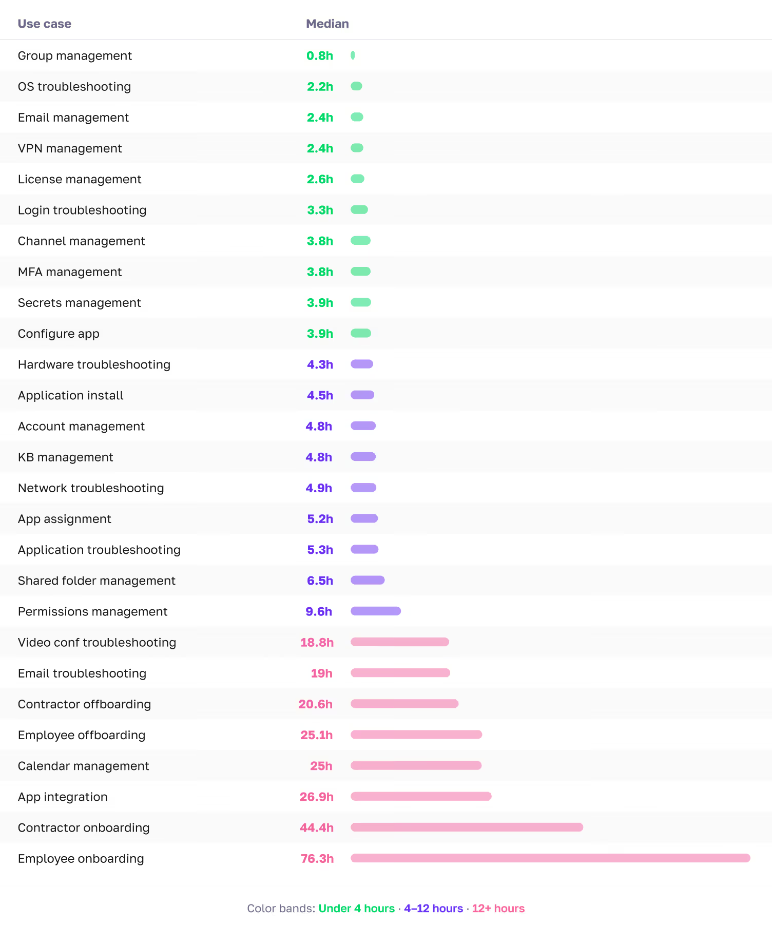
Most troubleshooting use cases resolve in the 2–5-hour range with AI automation. Identity-related use cases, including login troubleshooting, MFA management, and permissions management, range from 3-10 hours because of the coordination and verification steps involved. Even with heavy automation, many of these workflows require human approval or sign-off, which extends the clock. Onboarding and offboarding workflows live in their own tier and should be benchmarked separately.
The data shows that this is achievable regardless of automation level, across diverse ticket types, and at scale. If your current first response times are measured in hours, the gap is meaningful and closeable with better triage workflows, staffing adjustments, or AI-powered support tools.
IAM and connectivity tickets resolve in 3–4 hours with AI automation. Hardware and collaboration tickets take 3–5 hours. Onboarding and offboarding belong in their own tier at 25–75+ hours because their multi-step lifecycle workflows involve approval chains and third-party coordination.
AI automation doesn’t change how fast a ticket gets picked up — first response times are nearly identical at every automation level. But it changes resolution speed by a factor of 16x. Tickets without automation take a median of 71 hours to resolve. For the roughly 22% of tickets that are productivity-blocking, that means you may have an employee sitting idle for days. And because resolution speed drives user satisfaction, the downstream effects compound. Slower resolution means more frustrated users who stay frustrated. The question for any IT leader evaluating their support model isn’t, “Will automation make us faster to respond?” It’s, “Will it make us faster to resolve, and what is slow resolution costing us?”
.svg)
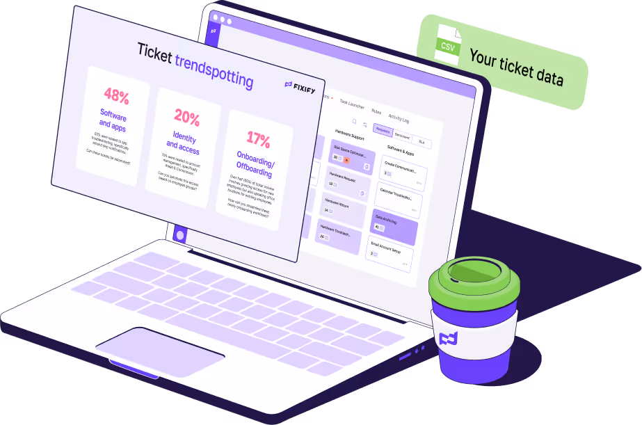
You've seen what 50,000 tickets reveal. Find out what yours say. Free customized report from 90 days of your ticket data.
All charts, stat callouts, and sidebars referenced in this report are listed below by section.
Chart numbers correspond to the order in which they appear.
This report is based on help desk ticket data collected across a range of organizations spanning fourteen months ending February 28, 2026. The organizations in the dataset range from early-stage startups to established companies with thousands of employees, and represent a variety of industries including computer software, cybersecurity, healthcare, financial services, IT services, and insurance. All data has been aggregated and anonymized; no individual organization is identified anywhere in the report.
Tickets were submitted by employees across all functions and levels within their organizations. The dataset includes tickets across nine defined categories and more than 50 use cases, covering everything from routine access requests to urgent hardware failures and employee onboarding workflows.
Ticket coverage. Sentiment data at submission is available for approximately 77% of tickets; sentiment at resolution is available for a smaller subset. Analyses that compare initial to final sentiment are based on the subset where both fields are populated.
Company profile coverage. Analyses that use company-level attributes — size, industry, remote work percentage — are based on the subset of tickets linked to complete company profile data. Tickets without linked company profiles are included in aggregate analyses but excluded from company-level breakdowns.
Time zone adjustment. All hour-of-day and time-of-day analyses use local time based on the headquarters location of each organization, not raw UTC timestamps. This ensures that patterns like morning peaks and evening tapers reflect actual local working conditions rather than time zone artifacts.
Automation levels. Tickets in the dataset are classified by the degree of AI automation involved in their resolution:
With AI automation: The majority of the resolution work — triage, diagnosis, action, and communication — was handled by AI. Human involvement is limited to approval or sign-off where required.
Without automation: A human agent performed the work with minimal automation beyond standard IT practices. These tickets typically involve multi-step coordination, vendor dependencies, or judgment calls that require human involvement.
Both automated and non-automated tickets are included in all aggregate figures unless otherwise noted. Section 5 presents benchmarks by automation level separately. Note that even tickets resolved with AI automation may involve wait time for human approval or sign-off — automation handles the execution, but the clock still runs while approvals are pending.
Resolution time treatment. Tickets with resolution times exceeding 10 days (14,400 minutes) were excluded from all resolution time benchmarks as likely data quality issues rather than genuine resolution events. A small number of tickets with negative resolution times were also excluded.
Statistical outliers. One organization in the dataset is substantially larger than the rest and generates a ticket mix that isn’t representative of the broader population. This organization is excluded from category distributions, per-employee analyses, and sentiment breakdowns to avoid distorting benchmarks. It is retained in aggregate volume trends and temporal patterns where its inclusion doesn’t distort findings.
Company size buckets. All size-based analyses use the following groupings: fewer than 100 employees (small), 100–499 employees (growth-stage), 500–999 employees (mid-large), and 1,000 or more employees (enterprise).
Normalized monthly index. To isolate seasonal patterns from overall volume growth, each organization's monthly ticket count is expressed as a percentage of its own average monthly rate, then aggregated across organizations with at least six months of data. An index of 100 represents a typical month; values above or below indicate above- or below-average activity.
AI automation levels. This report classifies tickets into two tiers: tickets resolved with AI automation and those resolved primarily with manual effort. See Appendix A for full definitions and Section 5 for the performance comparison.
Category. The top-level classification applied to each ticket. The nine categories used in this report are: Software & Applications, IAM (Identity & Access Management), Collaboration, Onboarding & Offboarding, Hardware, Connectivity, Security, Custom, and Other.
Final sentiment. The sentiment classification assigned at the time of ticket resolution, based on follow-up communication or resolution interactions. Available for a subset of tickets.
First response time. The elapsed time between ticket submission and the first substantive response delivered to the end user. Measured in minutes.
Initial sentiment. The sentiment classification assigned to a ticket at the time of submission, based on the language and tone of the user’s request. Classified as positive, neutral, or negative.
Normalized monthly index. A method used in Section 1 to isolate seasonal patterns from overall volume growth. See Appendix A for the full methodology.
Productivity-blocking ticket. A ticket where the issue prevents the affected employee from performing their work until it is resolved. Ten qualifying use cases are defined in Appendix C.
Resolution time. The elapsed time between ticket submission and ticket closure. Measured in minutes internally; reported in hours throughout this report for readability.
Sentiment improvement rate. The percentage of tickets that started with negative sentiment and ended with neutral or positive sentiment by resolution. The overall benchmark in this dataset is 82%.
Use case. A more specific classification nested within each category. There are more than 50 use cases across the dataset, ranging from “app assignment” and “login troubleshooting” to “employee onboarding” and “hardware troubleshooting.”
The nine ticket categories and their constituent use cases are listed below. Use cases marked with ★ are classified as productivity-blocking.
Software & Applications
App assignment, application troubleshooting ★, application install, configure app, license management, data backup & recovery, software & apps other
IAM (Identity & Access Management)
Login troubleshooting ★, MFA management ★, permissions management ★, account management, group management, app integration, IAM other
Collaboration
Channel management, email management, email troubleshooting, video conferencing troubleshooting, shared folder management, calendar management, KB management, collaboration other
Onboarding & Offboarding
Employee onboarding, employee offboarding, contractor onboarding, contractor offboarding, onboarding & offboarding other
Hardware
Hardware troubleshooting ★, OS troubleshooting ★, device provisioning, endpoint management, MDM management, server management, storage optimization, hardware other
Connectivity
Network troubleshooting ★, VPN management ★, domain management, network management, connectivity other
Security
Secrets management, security alert triage, security auditing, email security management, network security management, badge access management, security other
Custom
Authentication issue ★, unlock account ★, custom other
Other
Miscellaneous requests not fitting a standard category
Use cases marked ★ are classified as productivity-blocking — meaning the issue prevents the employee from performing their work until resolved.